Knowledge is Power and Data Can Look Scary: 3 Tips to Boost Your Confidence
Accurate data interpretation is immensely important in our pursuit of racial equity at the Foundation for a Healthy Saint Petersburg. We understand its crucial role in making informed decisions that positively impact our community. But let’s be honest. Data, charts, and graphs can be overwhelming for many, especially when they relate to something we care deeply about.
We totally get it. Sometimes, it can be hard to tell if you’re really understanding what you’re seeing. Is that chart saying what I think it is? And where did all this info come from anyway? Don’t worry, asking these sorts of questions is actually a very good thing! It means that you are thinking critically about the information you are digesting (as you should!). We believe that knowledge is power and, in this blog post, we will cover three strategies you can use to check the accuracy of data or graphs and conduct your own research for fact-checking.
Tip 1: Know that stats are NOT facts.
Using statistics and percentages is a great way to explain things, evaluate situations, and highlight differences or progress. They help us understand information, but it’s important to remember that statistics can be taken out of context, misleading, or even manipulated. For example, a study might show that 80% of individuals in a particular community don’t have young children living in the home. However, it’s important to find out more about who those people are and where they live. If I said that 80% of people in a senior housing community don’t have young children living with them, this statistic would make more sense. Therefore, when you encounter a statistic, always consider the context surrounding it. This context helps you to see the bigger picture.
Tip 2: Don’t let those lines trip you up.
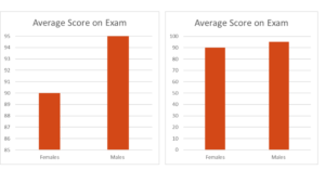
When analyzing a graph or bar chart, it’s important to examine both the x-axis (horizontal line) and y-axis (vertical line). This helps you understand what is being measured and how it’s being measured. In the examples shown below, the x-axis represents biological sex (male/female) and the y-axis displays the average score for each group on the exam. At first glance, the graph on the left appears to show a significant difference between males and females. However, it’s important to note that the y-axis starts at 85. By adding the total possible score (as shown in the graph on the right), we can see that the difference is not as significant as it initially appeared. It’s crucial to be aware of these potential discrepancies whenever you encounter visual representations of data, as they can be misleading.
Tip 3: Do your own research.
When you’re presented with data, statistics, and other research follow up with a bit of your own to decide if the information makes sense and has been accurately presented. Sure, Google can be a great place to start a search but be sure that the sites you visit from there are reputable. For example, government agencies like the CDC, NIH, and even reputable non-profit organization sites, are great tools to help determine if data has been accurately represented and to collect more contextual information. Here at the Foundation for a Healthy St. Petersburg, we value transparency, and you can freely access all our research and data reports through our website. Please feel free to utilize our website to explore the foundation’s racial equity initiatives and conduct your own research on our Pinellas County community. Knowledge is power!